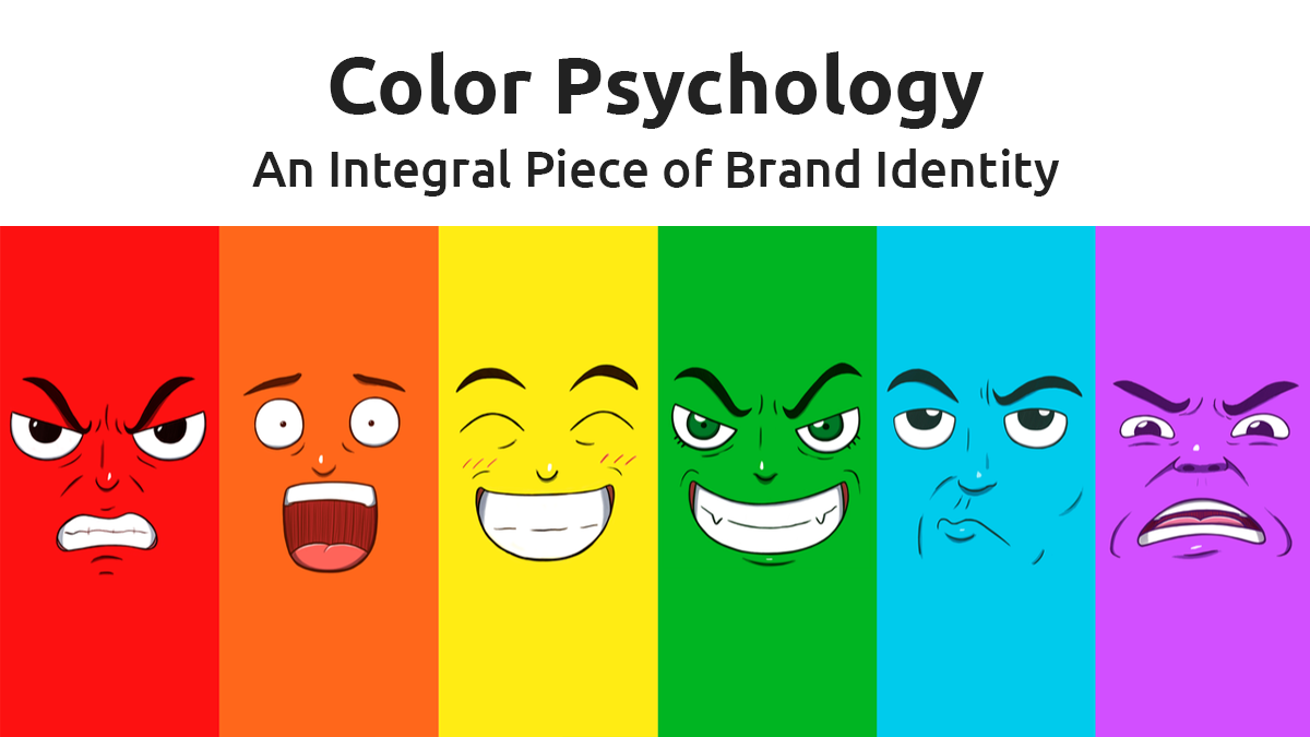
Colors are more than just visually appealing; they possess the remarkable ability to trigger emotions, influence perceptions, and even impact decision-making. As a graphic designer, understanding the psychology of colors is paramount in creating captivating designs that resonate with your audience. In this blog, we will delve into the world of color psychology, exploring how each color can evoke specific emotions and enhance branding. By harnessing the power of colors strategically, you can create designs that leave a lasting impression on your audience.
1. Red: Passion and Energy
Red is a dynamic color that commands attention and ignites passion. It evokes feelings of excitement, energy, and urgency, making it a popular choice for brands in the food, retail, and entertainment industries. When used sparingly, red can draw the eye to key elements and create a sense of urgency, encouraging action from your audience. However, use caution as excessive red may come across as aggressive and overwhelming.
Top Brand Example: Coca-Cola has masterfully employed the color red in its iconic logo, evoking happiness and energy, and creating a strong emotional connection with its audience.
2. Blue: Calm and Trust
Blue is one of the most universally loved colors, known for its calming and trustworthy qualities. It conveys a sense of stability, reliability, and professionalism, making it an ideal choice for finance, technology, and healthcare brands. Blue can also promote a feeling of security and dependability, encouraging trust and loyalty among customers.
Top Brand Example: Facebook has strategically utilized blue in its logo to foster a sense of trust and create a welcoming community for its users.

3. Yellow: Happiness and Optimism
Yellow is the epitome of positivity, exuding happiness, optimism, and warmth. As a high-visibility color, it grabs attention and is perfect for brands that want to promote positivity and a sense of joy. Yellow can be used to evoke a playful and friendly atmosphere, making it ideal for brands targeting a youthful audience.
Top Brand Example: McDonald’s uses yellow to convey happiness and excitement, inviting customers to experience the joy of their favorite meals.

4. Green: Nature and Growth
Green represents nature, growth, and renewal. It is associated with eco-friendliness, health, and harmony, making it a popular choice for brands focused on sustainability and environmental consciousness. Green can create a sense of tranquility and balance, making it appealing to brands in the wellness and natural products industries.
Top Brand Example: Starbucks’ green logo reflects its commitment to environmental sustainability and the natural origins of its products, resonating with eco-conscious consumers.
5. Orange: Creativity and Enthusiasm
Orange is a vibrant and energetic color that exudes creativity and enthusiasm. It encourages feelings of excitement and stimulates the appetite, making it a great choice for food and beverage brands. Orange can also evoke a sense of adventure and enthusiasm, perfect for brands seeking to evoke a lively and spirited persona.
Top Brand Example: Amazon’s orange logo sparks enthusiasm and excitement, encouraging customers to explore its extensive range of products.

6. Purple: Luxury and Imagination
Purple is a color of royalty, luxury, and sophistication. It conveys a sense of elegance and indulgence, often associated with high-end brands. Purple also has a strong connection with imagination and creativity, making it an excellent choice for brands in the arts and entertainment industry.
Top Brand Example: Cadbury uses purple to create a sense of luxury and indulgence for their chocolates, positioning their products as special treats.
7. Pink: Playfulness and Femininity
Pink is often associated with femininity, tenderness, and playfulness. It can evoke feelings of warmth and compassion, making it a popular choice for brands targeting a predominantly female audience. Pink is also used to promote a sense of innocence and youthfulness, making it a favorite among brands in the fashion, beauty, and childcare industries.
Top Brand Example: Victoria’s Secret, a renowned lingerie brand, uses pink in its branding to convey a sense of femininity, elegance, and sophistication.
8. White: Purity and Simplicity
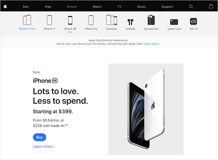
White is the epitome of purity, simplicity, and cleanliness. It represents a blank canvas and is often used to create a sense of space and clarity in designs. White is commonly seen in minimalistic and modern designs, as it allows other colors and elements to stand out. Brands that wish to convey a sense of sophistication and purity often opt for a white color palette.
Top Brand Example: Apple, known for its sleek and minimalist products, uses white extensively in its designs to evoke a sense of simplicity and elegance.
9. Black: Power and Elegance
Black is a color of authority, power, and elegance. It exudes sophistication and is commonly used in luxury brands to convey a sense of exclusivity and prestige. Black can also create a dramatic and bold effect, making it an excellent choice for brands seeking to make a strong statement.
Top Brand Example: Chanel, a luxury fashion brand, uses black as its signature color to symbolize timeless elegance and sophistication.
As a designer, understanding the emotional impact of colors is essential in crafting compelling designs. By strategically using colors, you can elicit specific emotions from your audience and reinforce your brand’s message. Take inspiration from top brands that have successfully harnessed the power of colors to create lasting impressions and build strong emotional connections with their customers. With this comprehensive guide to color psychology, you can confidently leverage the power of colors in your graphic designs to enhance branding and leave a lasting impact on your audience. Happy designing!
